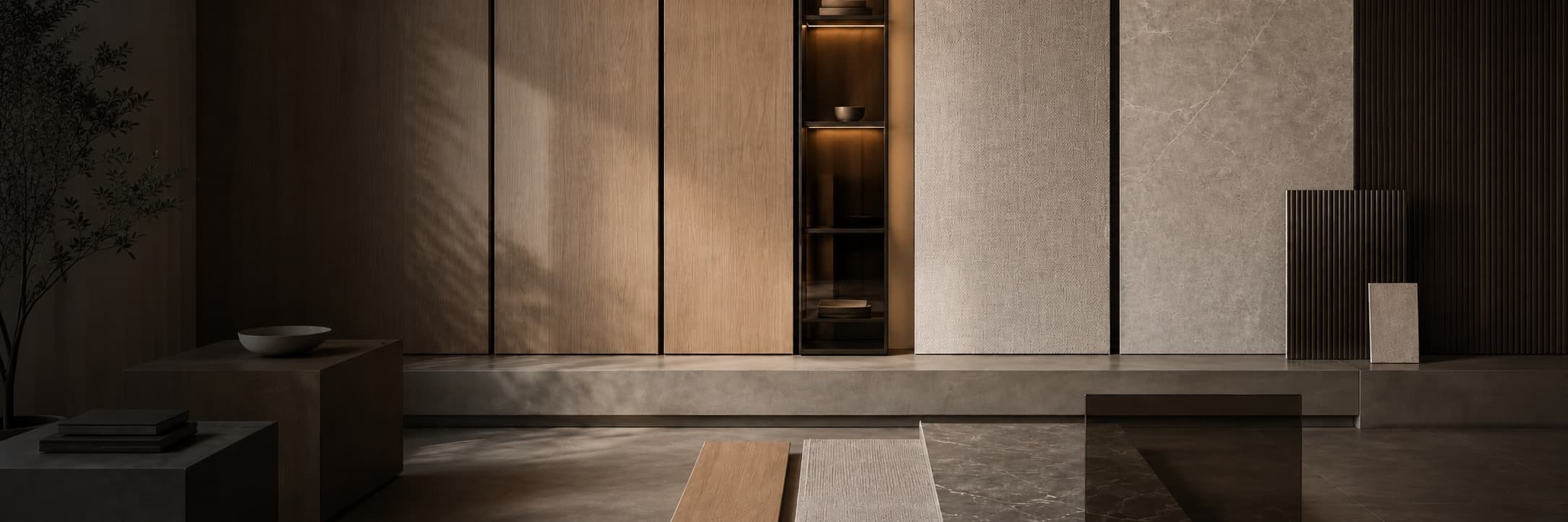
Spatial Positioning
Background finishes should support the displayed content and maintain clear visual hierarchy across entrance, display, and meeting areas.
- Define display focal points
- Unify continuous backgrounds
- Reduce unrelated color changes
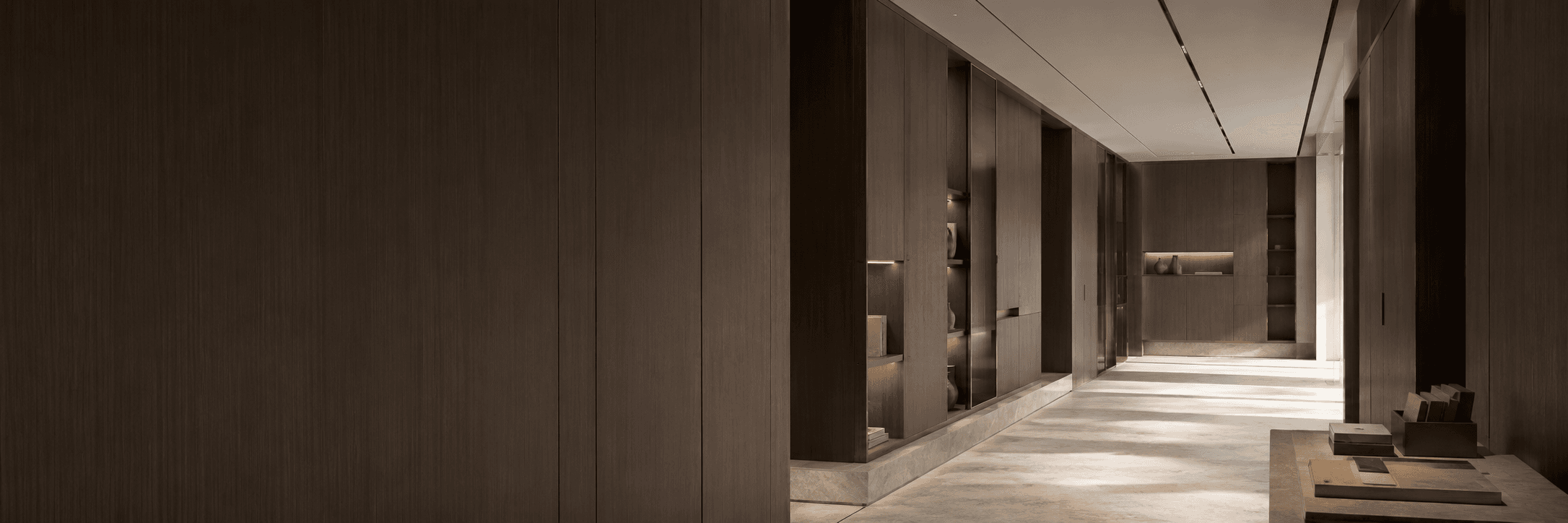
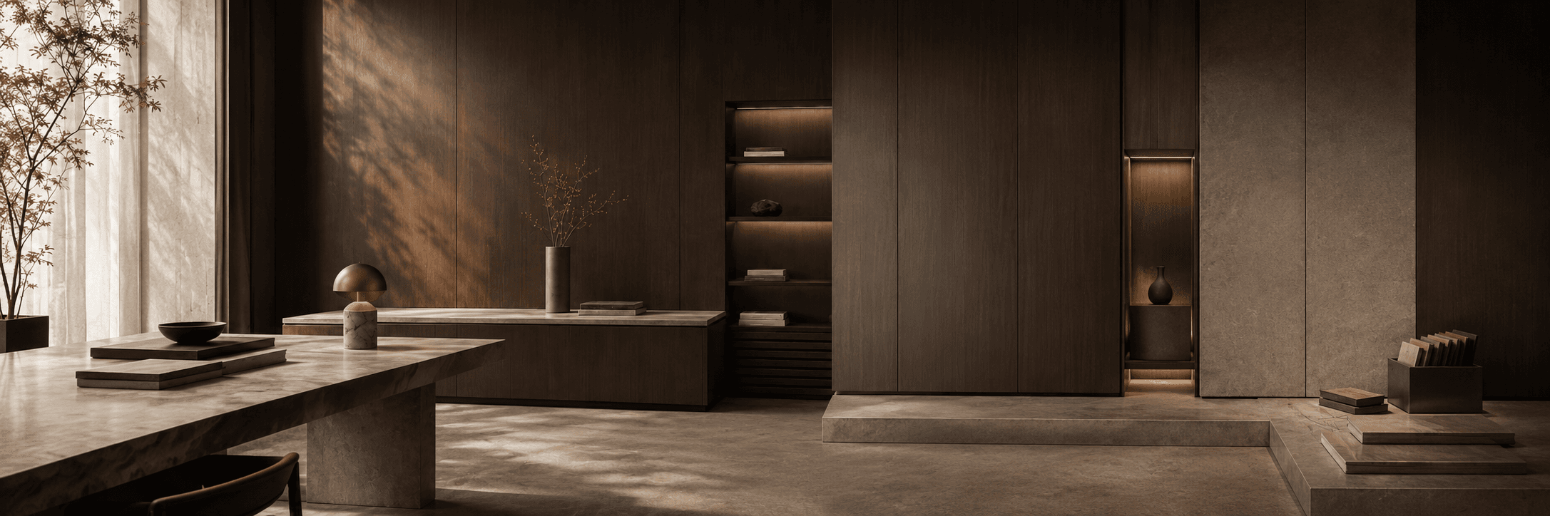
Application Space
Use continuous decorative surfaces to create a clear, restrained brand environment.
Keep large background surfaces unified, then use dark woodgrain, textile texture, and metal to create display focal points and zoned depth.
Suitable Positions
Application Logic
First define each material's position and role in the space, then use finish proportions and physical samples to confirm that the overall combination is balanced.
Background finishes should support the displayed content and maintain clear visual hierarchy across entrance, display, and meeting areas.
Low-contrast finishes suit large areas, while dark woodgrain and textile texture are better for local depth.
Base the final decision on physical samples, surface effects, and matching documents instead of allowing renderings to replace material confirmation.
Finish Combinations
Different finishes can serve as primary, background, and accent materials. Final color, texture, and surface should still be confirmed with physical samples.
Pairing Collection 01
2 finishes

Use Deep Coffee Thebes Walnut for continuous backgrounds and display cabinetry, with Constantin Beige Textile as a transition in reception and meeting areas.
Pairing Collection 02
1 finishes

Deep Coffee Thebes Walnut forms the main reception background and coordinates with low-saturation stone and metal.
Material Ratio
These proportions are an initial selection reference and should be assessed against the actual visible area, adjacent materials, and spatial lighting.
45%–60%
Create a unified and enduring spatial base
20%–30%
Strengthen display areas and brand focal points
10%–20%
Connect reception, meeting, and display areas
Selection Check
When confirming a finish, review the physical sample, adjacent materials, surface effect, and edge-banding match together.
Use images to screen directions; assess color, texture, gloss, and tactile feel with a physical sample.
Compare the decorative surface with adjacent worktops, walls, floors, metal, and other materials under the same light.
After confirming the finish, verify the surface, grain direction, edge-banding match, and available product documents.
FAQ
Both work. Woodgrain creates warmth, while solid colors and textile textures make quieter backgrounds. Combine them according to the displayed content and brand character.
Yes, but assess the space scale, lighting, and displayed content. In smaller or dimmer areas, use dark finishes on display walls and local focal points.
Limit the number of primary finishes and confirm physical samples, grain direction, surface gloss, and edge-banding matches together, then compare them with floors, worktops, and metal.
Share the desired spatial effect, application position, and preferred tone. We can help screen finishes and prepare physical samples.