01
Position
Role in the space
Use it for roughly one-third of the main joinery, balanced by a light base and cool-toned furniture.
- Family living-room wall system
- Kitchen cabinetry and tall units
- Study and bedside joinery
Moroni Teak RED
Fine straight woodgrain in a reddish warm brown, creates a stable and enduring surface foundation for contemporary spaces.
当前正确色板图显示, XT-2730 莫洛尼红柚是一款Medium value, 偏红而低黄度的暖棕柚木色, Texture细密而克制.它适合与奶油白, 靛蓝, 橄榄绿, Brick red, 浅石材和少量镀铬或Charcoal Black线条建立清晰对比, 可用于Family living-room wall system, KitchenCabinet Doors, Study Cabinetry体及Bedroom局部木作.
Technical and Delivery Information
Substrate
定制防潮净味LSB / ImportedVECO / Custom Juneng Plywood/海洋多层板
Thickness
9mm/12mm/18mm/22mm/25mm
Size
1220mm*2440mm / 1220mm*2800mm
Surface
VN/SK多种Surface处理可搭配
Edge Banding
标配1.0mm*22mm, 60 0.8*60mm ABS-GEdge Banding0.6mm*60mm软成型 ABS-GEdge Banding 标配1.0mm*22mm激光Edge Banding带
Type
Fine straight woodgrain in a reddish warm brown
Application
Living-room wall system, doors, and low cabinetry / Kitchen cabinet doors and tall units / Desk and record cabinet
Space
Family living room and transitional dining area / Kitchen / Study and media corner / Bedroom and tea corner
Definition
A medium-value reddish warm-brown fine grain suited to a warm primary material without excessive yellow.
Position
Use it for roughly one-third of the main joinery, balanced by a light base and cool-toned furniture.
Texture
A reddish warm-brown base with fine straight grain reads continuously overall and reveals depth up close.
Boundary
Use neutral daylight and warm-cool contrast to keep the wood from shifting into an all-over orange-brown.
Application
High-engagement references repeatedly favor a controlled proportion of wood rather than an entirely warm-brown interior, adding a warm-white base, indigo or olive green, brick-red textiles, light stone, and small amounts of chrome or charcoal detail. The four scenes below follow this direction with distinct spatial structures and color logic.
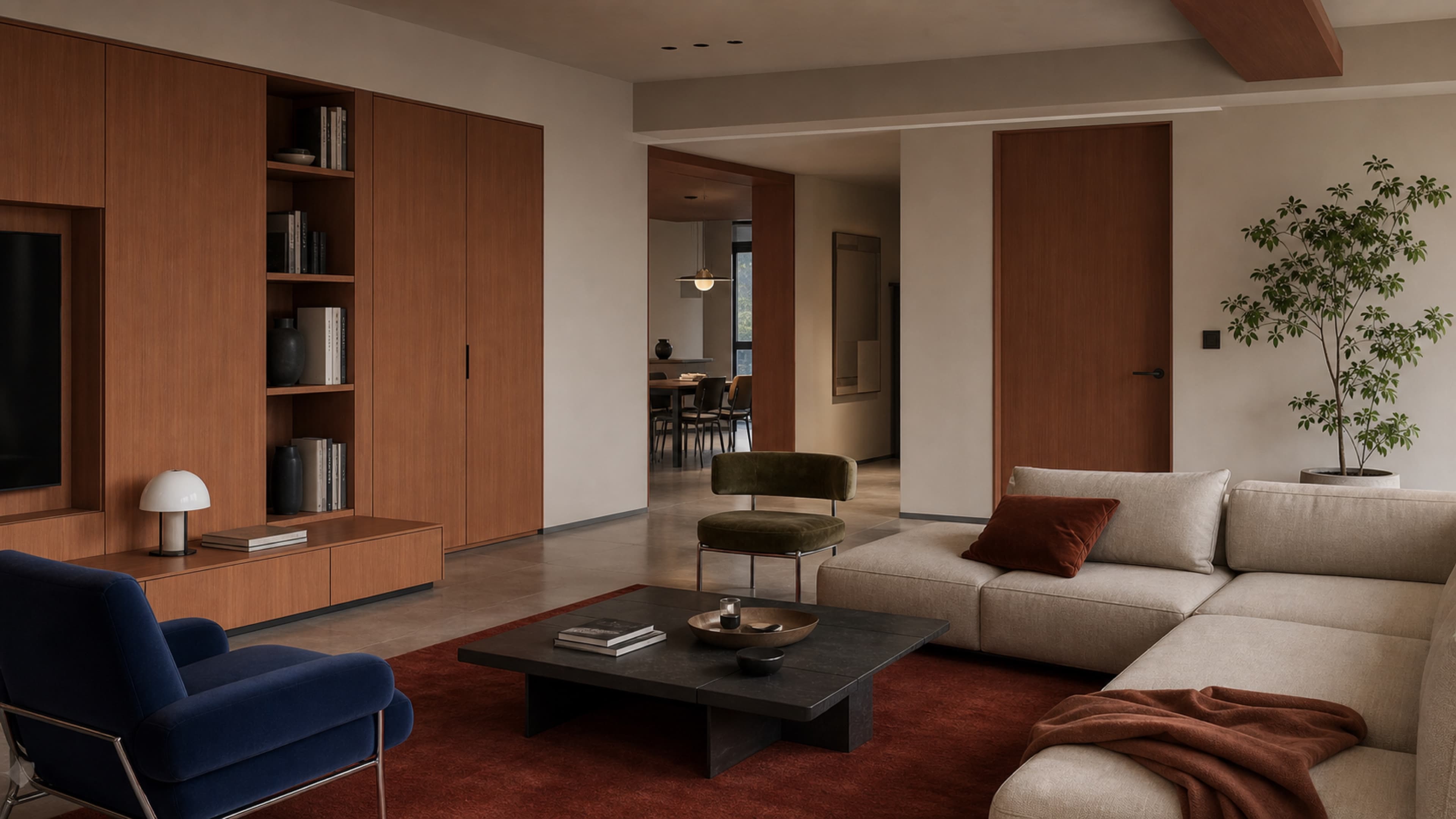
Spatial visualization. Confirm actual color, texture, and workmanship with a physical sample.
Wood covers approximately 30–35% of the visible fixed surfaces
Full-height wall system, low media cabinet, doors, and framed opening
Use warm white and light stone as the base, then build warm-cool contrast with indigo, olive green, and brick-red textiles without making white the only focal tone.
Wood covers approximately 30–40% of the fixed surfaces
Base cabinets, one full-height tall unit, and a small number of open shelves
Pair with cream-white tiles, brushed stainless steel, and a light floor so the teak remains fresh in natural daylight.
Wood covers approximately 25–35% of the fixed surfaces
Horizontal desk, low cabinet, selected tall units, and record cabinet
Use sea-salt blue, mustard yellow, and stainless steel as restrained accents rather than distributing several saturated colors evenly.
Wood covers approximately 25–35% of the fixed surfaces
Selected headboard joinery, bedside cabinet, and low window cabinet
Prioritize warm-white textiles and generous wall space, using a charcoal niche to define boundaries and add depth.
Light & Proportion
First define the finish's role in the space, then use lighting, background materials, and accents to adjust visual weight.
Content status · Sample review pendingLighting
The approved swatch already has a reddish warm-brown cast. Low color-temperature lighting throughout can push it toward orange-yellow. Establish even ambient lighting close to daylight first, then add a small amount of warm light in open shelves or reading corners.
Color temperature
本款色号随光源色温呈现差异化木色表现: 在 6000-6500K 正白光环境下, 呈现泰柚质感的金黄WoodTone;在 3000-4000K Warm White光环境下, 呈现红柚质感的暖红Wood色泽.
Ambient lighting
Prioritize continuous, soft ambient light and natural light so the wood finish, warm-white walls, and cool accents maintain a stable relationship.
Accent lighting
Concealed linear lights can be used at open shelves, the bedside, or the desk, but should not sit too close to the panel surface. Dark-green stone and stainless steel do not need additional warm-toned illumination.
On-site confirmation
Compare the physical sample in daylight, under the project ambient lighting, and with local lights on to confirm that the face, edge banding, and shadow areas do not shift noticeably orange.
Proportion
The phrase "40% teak" appears in high-engagement Xiaohongshu references, while popular Pinterest searches repeatedly show warm wood contrasted with warm white, indigo, olive green, and brick red. This page turns that relationship into design guidance: wood provides warmth, light tones form the base, and cool colors, textiles, and metal define the edges. It is not a fixed formula.
Reddish warm-brown primary material
30–45%
Low cabinetry, kitchen doors, desks, selected tall units, and bedside joinery
Warm-white and light base
40–55%
Warm-white walls, cream textiles, light stone, and light flooring
Cool tones and linear details
8–20%
Indigo, olive green, brick-red textiles, and chrome or charcoal lines
These are proposal-stage guidance values derived from observations of high-engagement references, not fixed ratios or product specifications. Adjust them for the space, natural light, project lighting, and physical samples.
Scene Gallery
See how the finish changes across continuous surfaces and local details through different spatial structures, cabinetry roles, camera views, and lighting conditions.
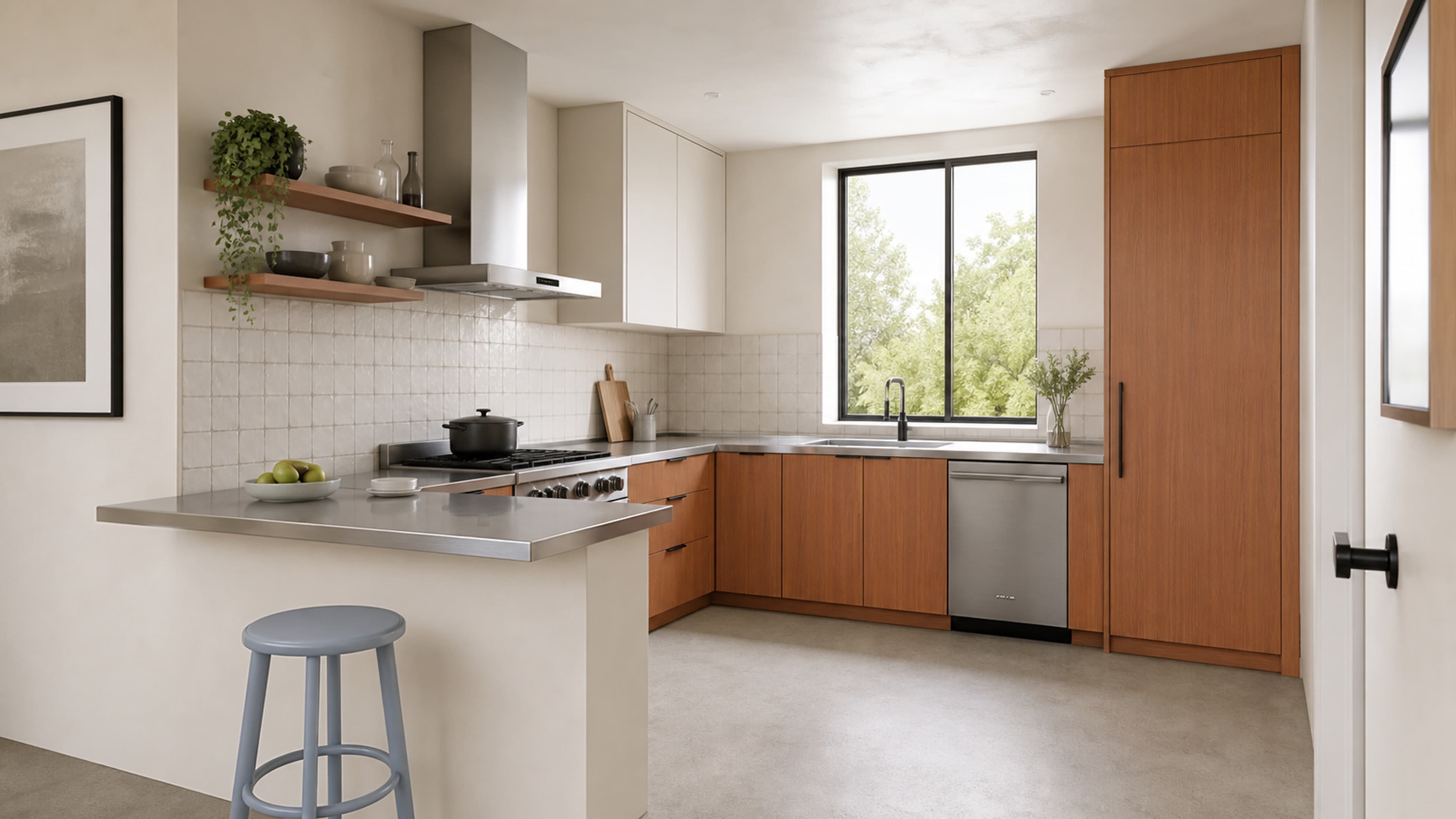
Cream-white and stainless-steel kitchen
Spatial visualizationCream-white tiles and brushed stainless steel separate the warm teak from an orange-brown field, while one sea-salt blue chair adds a light cool-toned accent.
Spatial visualization图;实际颜色, Texture与工艺请以Physical samples为准.
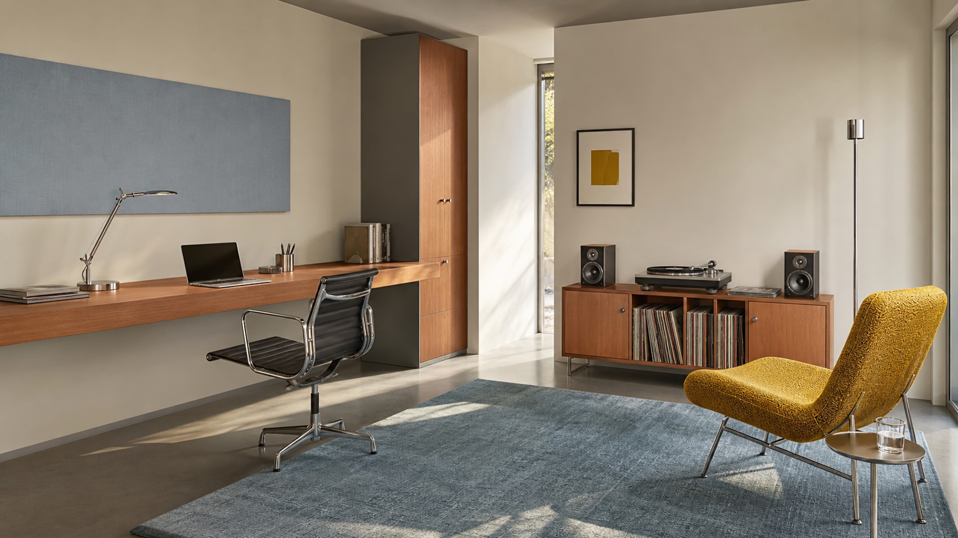
Bauhaus study and record corner
Spatial visualizationSea-salt blue carries the broad cool background, with mustard yellow as a single accent. Chrome furniture and black lines sharpen the warm teak.
Spatial visualization图;实际颜色, Texture与工艺请以Physical samples为准.
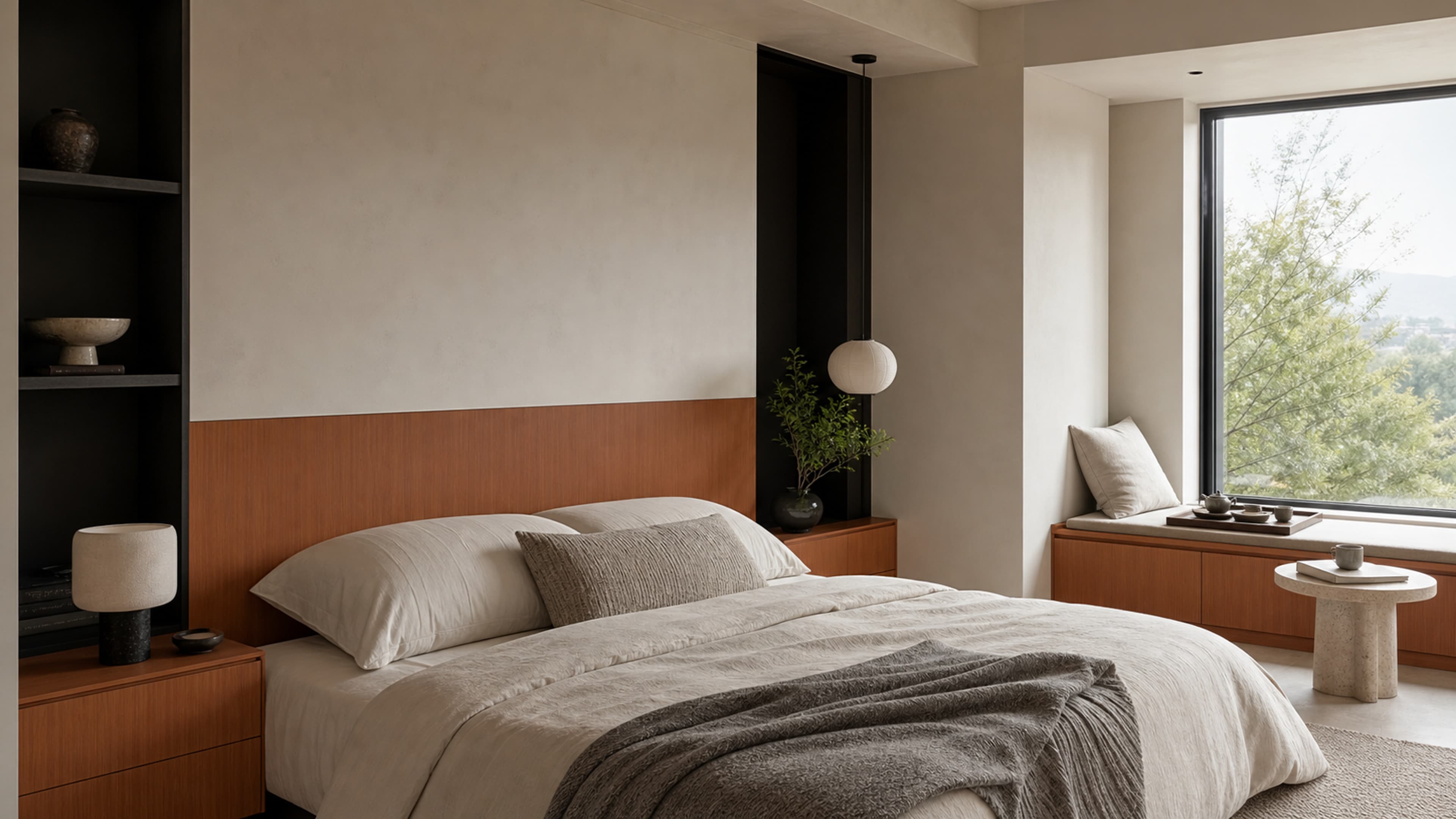
Warm-white bedroom and window-side tea corner
Spatial visualizationWarm-white walls and ivory bedding occupy the main area, a charcoal niche anchors the boundary, and teak appears as a low continuous element.
Spatial visualization图;实际颜色, Texture与工艺请以Physical samples为准.
Palette
Use low-saturation materials to build spatial relationships.
Warm White
Use on walls, ceilings, textiles, and square tiles to create the largest field of negative space and support the warm teak.
Muted Olive
Use on one lounge chair, a small amount of textile, or greenery to contrast the wood with cool green. Avoid distributing it evenly in many places.
Deep Indigo
Suitable for a principal lounge chair, selected textiles, or one acoustic wall panel as the cool anchor in a Bauhaus setting.
Brick Red
Suitable for rugs, cushions, or throws that echo the reddish warm-brown wood, but only in small textile areas.
Limestone
Use for dining tables, worktops, side tables, and flooring to provide stable light volumes and a matte texture.
Stainless & Charcoal
Use for worktops, table legs, handles, niches, and fine trims to establish clear boundaries.
Delivery
Confirm samples, edge-banding direction, and site trims in advance to reduce color and detail discrepancies in the finished project.
01
This content is based on the user-approved swatch scan and generated visualizations. Confirm actual color, grain scale, and surface sheen with a physical sample.
02
Confirm a face sample and edge-banding sample from the same batch before deciding grain direction for cabinet doors, side panels, and continuous wall panels.
03
The proportions and palette come from proposal-stage work and observations of high-engagement platform references. They do not replace project lighting calculations, material sampling, or technical confirmation.
FAQ
Answers to common early-stage questions about quantity, edge banding, pairing, and order confirmation.
It can be used as the principal joinery, but first compare options at approximately 30–45% of the visible fixed surfaces and retain enough warm white, light stone, or textile. This is design guidance, not a fixed standard.
Begin by comparing an overall color temperature of 3500–4000K; local ambient lighting may be warmer. Review a physical sample under the actual project lighting so whole-room warm light does not shift the wood noticeably orange.
Prioritize warm white and cream, light stone, indigo or muted olive green, small amounts of brick-red textile, and chrome, stainless-steel, or charcoal lines.
No. It comes from observations of high-engagement references and supports proposal discussions and visual comparison. Adjust the actual proportion for the space, daylight, function, and physical samples.
Confirm the physical sample, matching edge banding, grain direction, and project lighting. The website visualizations show spatial relationships and do not replace confirmation of physical color and workmanship.